

Advertise | Membership
Join 22,000+ COO’s and operators
Morning Operators ⚙️
Happy 4th to our US-based readers 🇺🇲
Thank you to everyone who answered our poll on playbook topics last week.
The people have spoken, and I was very happy to discover that you all are a bunch of nerds after my own heart.
Today, we’re honoring the results of the poll and talking business intelligence & data visualization 🤝
⚙️ Here’s what we got going on today:
3 Charts You’re Not Using Enough → No more busted bar charts
Tell (Good) Stories With Data → “A long time ago, in a fiscal year far, far away…”
Excel Macros for Newbies → If you can click a mouse, you can save some time in Excel
Let’s dive in.
PS: Want even more actionable content for operations professionals? Connect with us on Linkedin

Together With Attio
The CRM for the Next Era of Companies

Attio is a radically new CRM for the next era of companies. It’s powerful, flexible, and works for any go-to-market motion from self-serve to sales-led.
Onboarding into Attio is so frictionless and intuitive that everything is ready in just a few clicks.
Step 1 → Sign in with your existing Gmail account
Step 2 → Answer 2 questions about your intended use
Step 3 → Watch Attio magically create your populated CRM with profiles for every person / company you’ve ever met - all enriched with data points from their website to revenue
Why spend weeks setting up your CRM when you can get it done today?
5 Operator’s Library Links
Teach your team how to tell a story with their data (and save yourself from watching their mind-numbingly boring presentation).
Looking for what to work on next to improve your product? Zuck says it’s all about listening to your users and leaning into the data.
When collecting data for business intelligence, follow these 7 best practices.
Here’s a little hack to get your team to start thinking like data scientists.
This essay argues that some things just can’t be measured (grab a coffee and put your feet up, it’s a doozy).
I. 3 Underutilized Ways to Visualize Data
Insight from Andy Haselsteiner, Tableau, and Tori Clifford
It’s 12:32 AM, and you’re still cooking up that deck for the board presentation.
You’re about to build your 48th bar chart of the night, when that little voice in the back of your head starts questioning you.
Is four dozen of the same chart too many?
In case you’re genuinely wondering, here’s a pie chart with data on how your audience might react to that next slide 👇

If we’re being honest with ourselves, most of us are using the same few charts over and over again. Pie charts, basic line charts, maybe a stacked bar graph if you’re feeling fancy 🎩
So, for today’s first tip, we thought we’d walk you through a few underutilized ways to visualize data (and when to use them).
Sankey Diagram
This beauty takes your tables of data and transforms them into an easy-to-follow flow diagram.
You’ll want to use colours to direct the eye to different streams, making your data instantly understandable.
Need an example? Here’s a Sankey diagram showing individual revenue streams for Apple products:
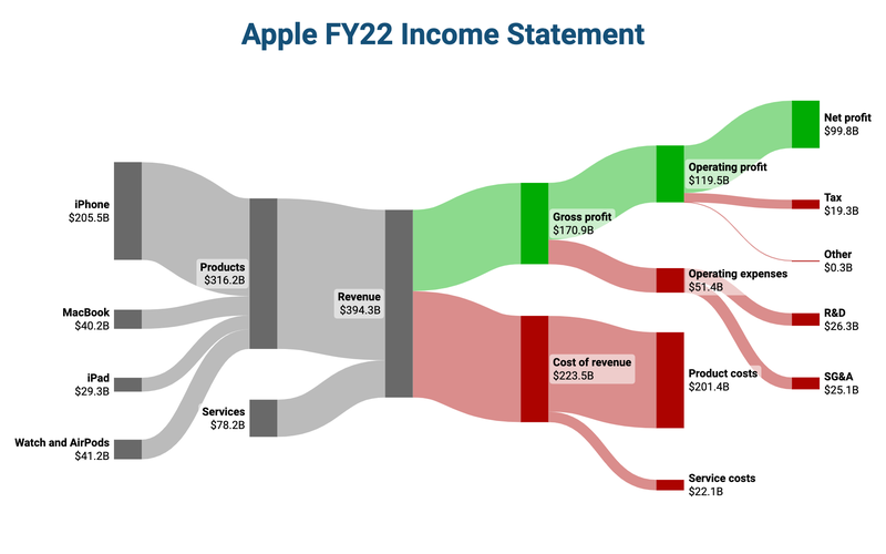
You’ll want to use Sankey diagrams for:
Income statements
Customer journey mapping
Sales & marketing funnels
Want to try building one? You can play around with them here.
Gantt Chart
This one is the project manager’s best friend.
If you’re ever wanting to visualize a timeline or project plan, consider using a Gantt chart.
It breaks down complex projects into manageable tasks, each with its own duration and dependencies.
If built correctly, everyone will understand their responsibilities, milestones, and timelines (and, of course, execute perfectly - right? 😬).
Check out the below example:
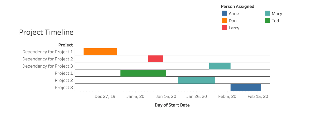
As you might imagine, you’ll want to use Gantt charts for:
Planning project phases
Tracking progress of initiatives
Coordinating team activities
Chord Diagram
This one’s for our overachievers. Opportunities to use a chord diagram are a little rarer, but they really hit when you get the chance 👌
These circular graphs take data with complex relationships and distill them into one visual. By showcasing the flow between different entities, it highlights patterns and correlations that might be buried in raw data.
Again, you’ll want to use varied colours to represent different groups. It will make it a little easier to distinguish connections and flows at a glance.
Here’s an example showing consumer brand loyalty to cell phone manufacturers:
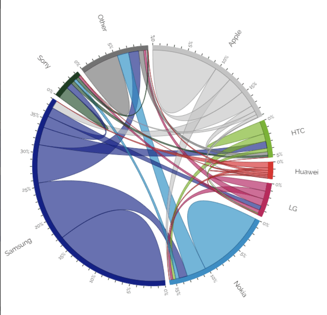
Use Chord Diagrams for:
Economic flows (e.g. global trends and industry forecasts)
Illustrating the flow of information or collaboration between different departments
Displaying the flow of financial resources within your organization
II. Telling (Good) Stories with Data
Insight from Scott Berinato
Okay, so now you’ve got a better variety of charts in your arsenal.
But guess what? Those charts aren’t going to convince anyone of anything without a good story behind them.
You can pay a McKinsey consultant $800/hr to tell that story, or you can learn to tell one yourself.
Let’s save you that $500k with a simple framework to get you started.
All you need are three acts: a setup, a conflict, and a resolution.
It worked when we started telling stories ~300,000 years ago, and it still works today.
A very simple example:
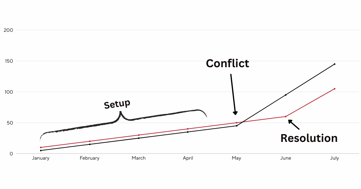
The Setup (the situation as it was - “the status quo”): For the last 10 months, we’ve been building widgets at the same rate as our competitor 😀
The Conflict (a change in the status quo, something is different now!): In May, our competitor unlocked a new widget building method 😞
Resolution (how we’re addressing the conflict): This month, we figured out a similar technology, and we’re building widgets at the same rate again! 😀
The better you get at identifying these three concepts, the better you get at telling stories with the data at your disposal.
Next time you’re putting together a slide, consciously note the setup, conflict, and resolution of the story you’re trying to tell.
Learn more: How to effectively tell a story with data
III. Excel Macros for Newbies
Insight from Cody Baldwin
Every month we get a financial report in Excel, right? And we diligently (of course) organize, edit, delete columns, and reorganize the cells to get it ready for export.
I don’t know about you, but after the second time of doing this, I know exactly what I want it to look like.
I do not, however, want to spend the 10-20 minutes reformatting that sh*t every time. We automate ‘round these parts.
That’s why we’re going to create a ✨ macro ✨.
A macro is a piece of code that executes any series of steps within Excel. The easiest way to create a macro is to simply have Excel record the actions as you take them.
If you’re an Excel junkie (aka my people), you may already know how to do this. If you’re not, do not worry. We’re going to walk through the process in four steps:
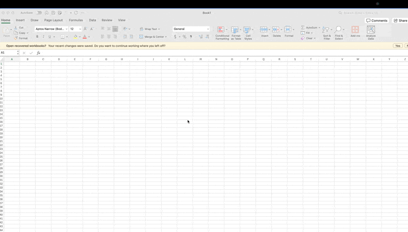
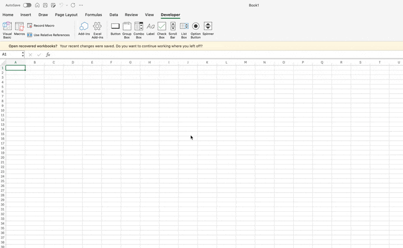
Create a Developer tab. Go to Excel → Preferences → Ribbon & Toolbar. Check the box in the righthand list that says “Developer” and then “Save.” You’ll now see the Developer tab on the top navigation bar of your spreadsheet.
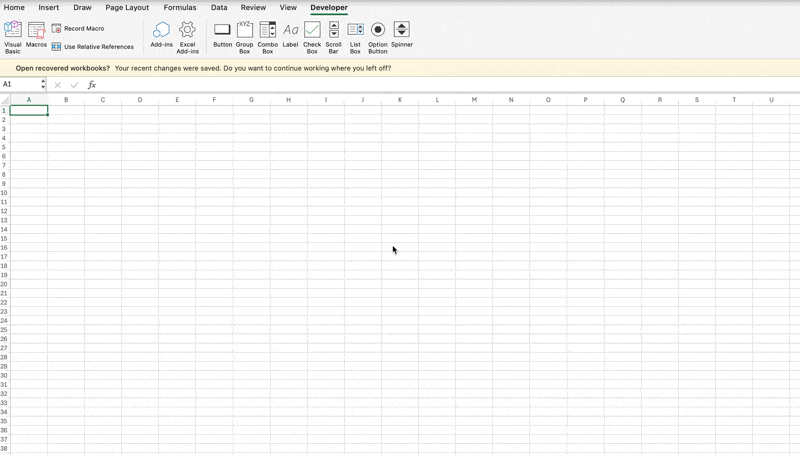
Click “Record Macro.” You’ll need to add a name and description (e.g. monthly revenue report). You’ll now see the “Record” button has turned into “Stop Recording.” This is good. Excel is tracking all your mouse clicks.
Make all of your edits and then press “Stop Recording.” Save the file as an “Excel Macro-Enabled Workbook” from the pull down menu.
To check that it worked, click on the “Macros” button in the top left and “Run.” This will show you all of the changes you’ve made.
You’ve now learned about the Macro feature in Excel, basically programming instructions for recurring reports.
Go forth and save time!
Something Fun

Last Word 👋
How am I doing?
I take all feedback I receive to heart. Keep it coming!
Am I covering the topics that are important to you? What else do you want me to include?
Just hit reply and let me know – I'd love to hear from you!
Cheers,
Rameel from The Bottleneck

Spread The Word
Refer one friend to receive an inside look into what 238 executives are prioritizing in Q3.

