
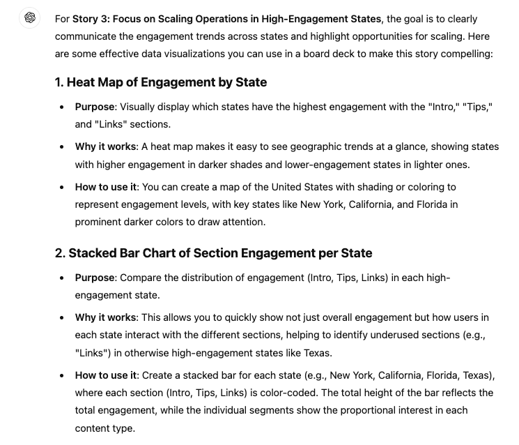
Data Visualization in 90 seconds
Insight from Rameel Sheikh
Now, let’s create a visualization to help us communicate the stories we got from that last output.
Start with this prompt:
“What are some effective data visualizations I can leverage to communicate [STORY FROM LAST OUTPUT] in a board deck?”
That should get you an output like this 👇
Now comes the cool part 😎
From here, we can pick one of these options and actually have ChatGPT create the chart for us.
Not only that, but we can switch to an interactive version of the chart that gives us greater flexibility on the design of the chart and the data displayed.
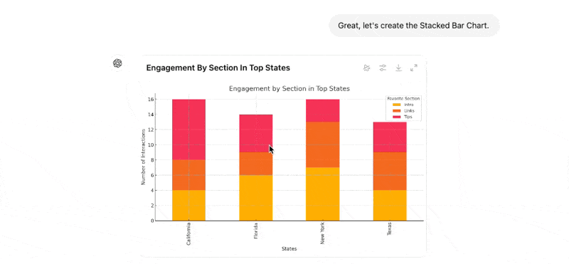
Once we have the chart designed just the way we want, we can download the image straight from ChatGPT and throw it right in the deck.
Using this workflow, we can go from raw CSV to useful, story-driven visualizations in a little less than 3 minutes (we timed it).
Don’t say we never showed you anything useful 😉