
Insight from Andy Haselsteiner, Tableau, and Tori Clifford
It’s 12:32 AM, and you’re still cooking up that deck for the board presentation.
You’re about to build your 48th bar chart of the night, when that little voice in the back of your head starts questioning you.
Is four dozen of the same chart too many?
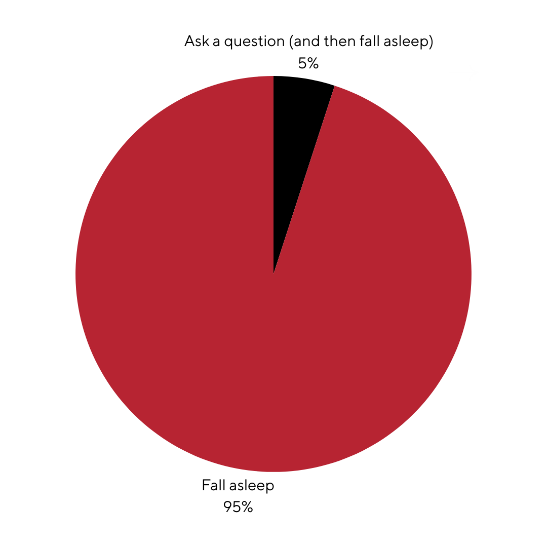
In case you’re genuinely wondering, here’s a pie chart with data on how your audience might react to that next slide 👇
If we’re being honest with ourselves, most of us are using the same few charts over and over again. Pie charts, basic line charts, maybe a stacked bar graph if you’re feeling fancy 🎩
So, for today’s first tip, we thought we’d walk you through a few underutilized ways to visualize data (and when to use them).
Sankey Diagram
This beauty takes your tables of data and transforms them into an easy-to-follow flow diagram.
You’ll want to use colours to direct the eye to different streams, making your data instantly understandable.
Need an example? Here’s a Sankey diagram showing individual revenue streams for Apple products:
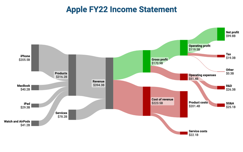
You’ll want to use Sankey diagrams for:
Income statements
Customer journey mapping
Sales & marketing funnels
Want to try building one? You can play around with them here.
Gantt Chart
This one is the project manager’s best friend.
If you’re ever wanting to visualize a timeline or project plan, consider using a Gantt chart.
It breaks down complex projects into manageable tasks, each with its own duration and dependencies.
If built correctly, everyone will understand their responsibilities, milestones, and timelines (and, of course, execute perfectly - right? 😬).
Check out the below example:
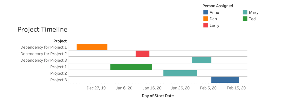
As you might imagine, you’ll want to use Gantt charts for:
Planning project phases
Tracking progress of initiatives
Coordinating team activities
Chord Diagram
This one’s for our overachievers. Opportunities to use a chord diagram are a little rarer, but they really hit when you get the chance 👌
These circular graphs take data with complex relationships and distill them into one visual. By showcasing the flow between different entities, it highlights patterns and correlations that might be buried in raw data.
Again, you’ll want to use varied colours to represent different groups. It will make it a little easier to distinguish connections and flows at a glance.
Here’s an example showing consumer brand loyalty to cell phone manufacturers:
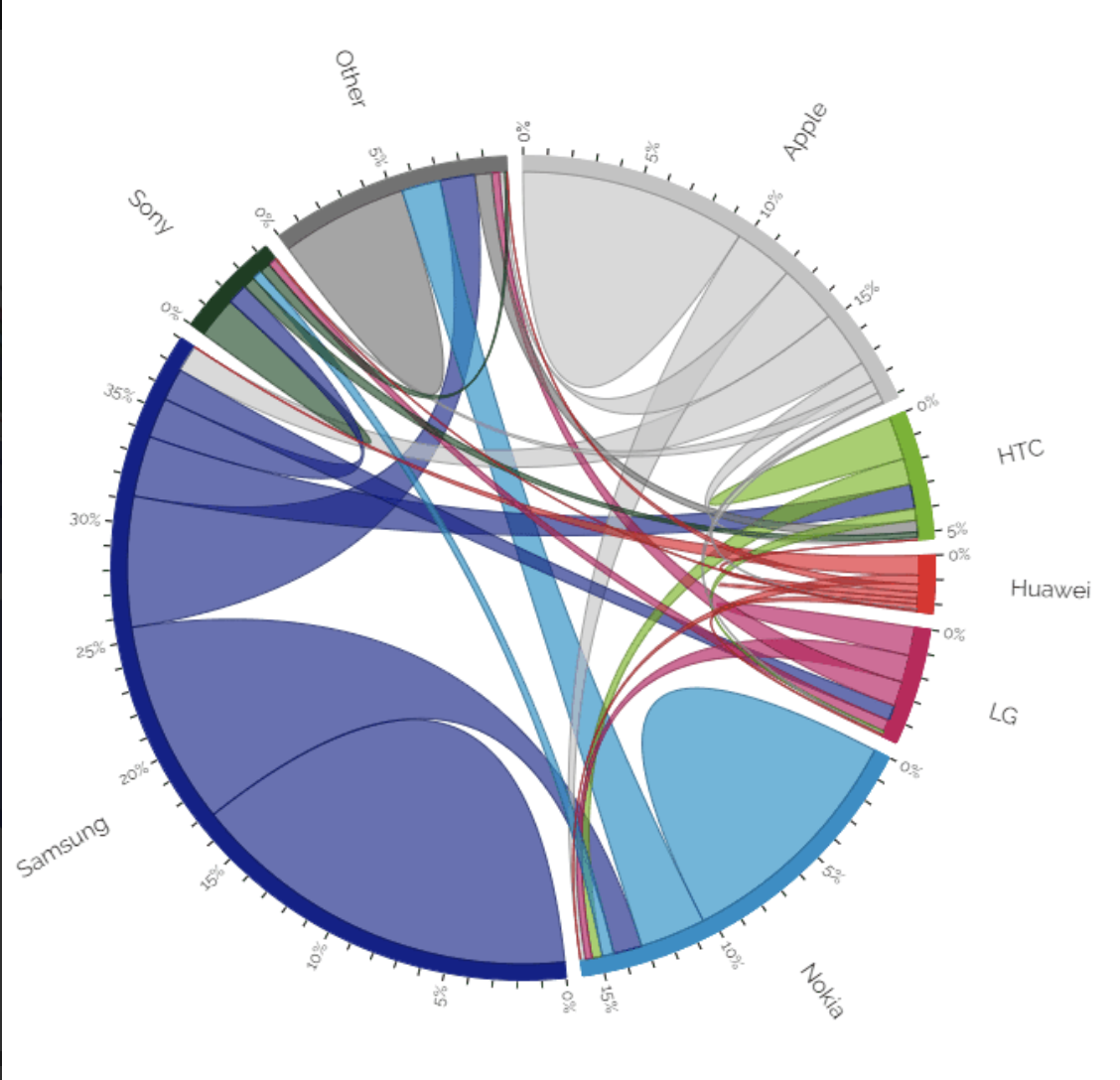
Use Chord Diagrams for:
Economic flows (e.g. global trends and industry forecasts)
Illustrating the flow of information or collaboration between different departments
Displaying the flow of financial resources within your organization